Tricap
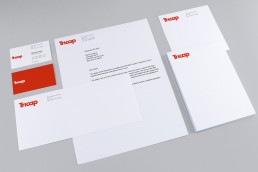
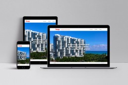
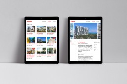
The brand identity and website is designed for Tricap — a New York-based real estate development and investment firm. The logotype designed in bold and timeless sans-serif typeface with trimming a tittle (the dot above ‘i’) in letter i and sharing counters (the area of a letter that is entirely or partially enclosed by a letter form) to create a rhythm for the eye to follow. The primary color “warm red” was chosen to invoke the powerful presence and make differentiate Tricap from competitors.
ClientTricapProject TypeBranding, Identity, WebsiteCreative DirectionGHD Partners