
Client
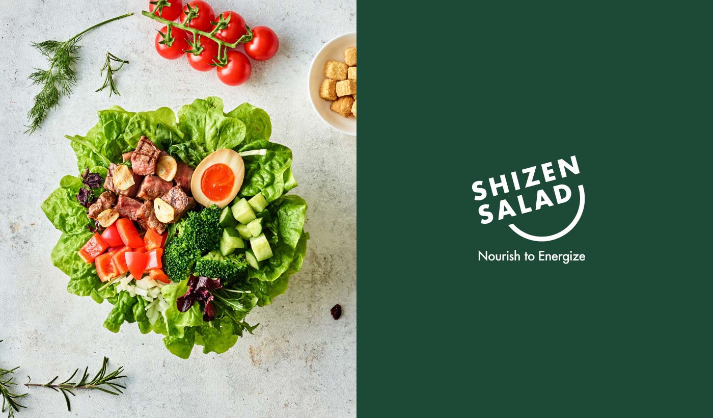
Shizen Salad
The client set out to launch a modern custom salad business in Osaka. The goal was to provide a vibrant, healthy alternative that balances everyday affordability with premium quality, serving as a fresh new hub for local professionals and residents.
The Challenge
Our challenge was to build a completely new brand from the ground up, starting with the naming. We needed to create a highly approachable, energetic identity that instantly communicates "freshness and wellness." Furthermore, this design had to scale seamlessly across multiple touchpoints—from digital delivery platforms like Uber Eats to eco-friendly physical packaging and the in-store experience.
The Solution
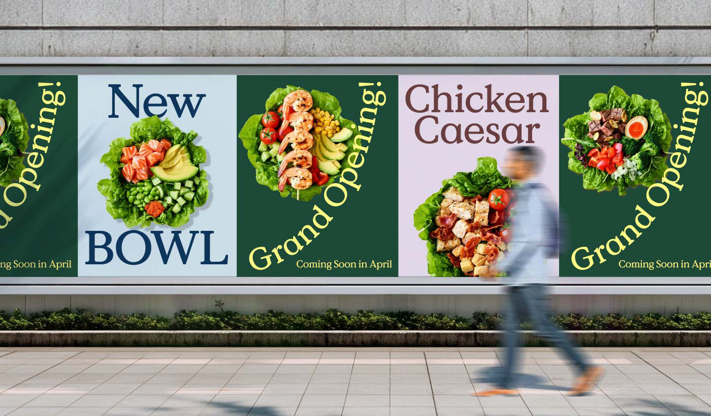
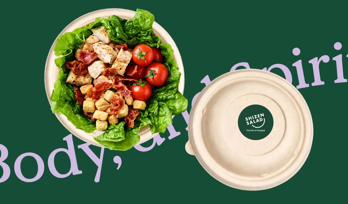
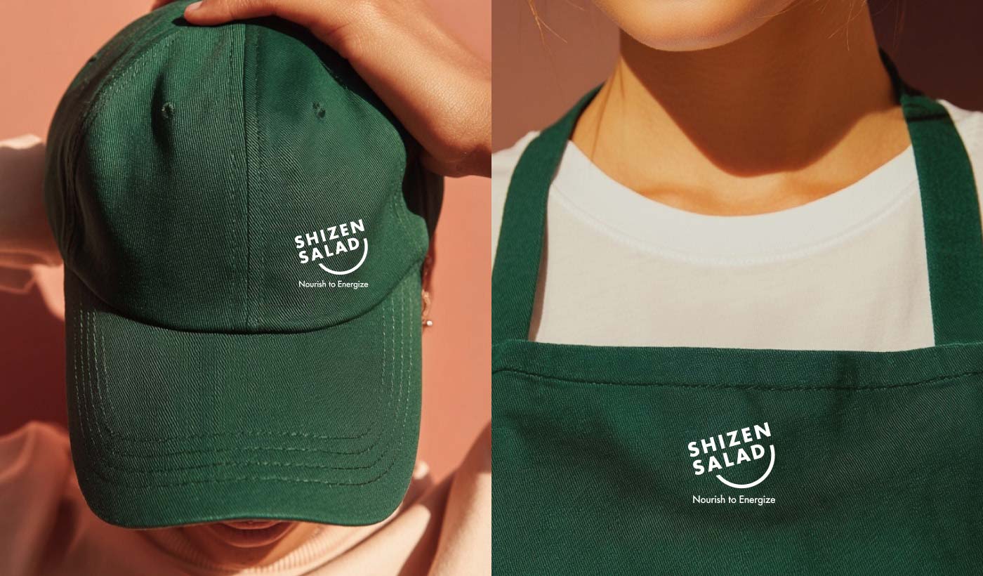
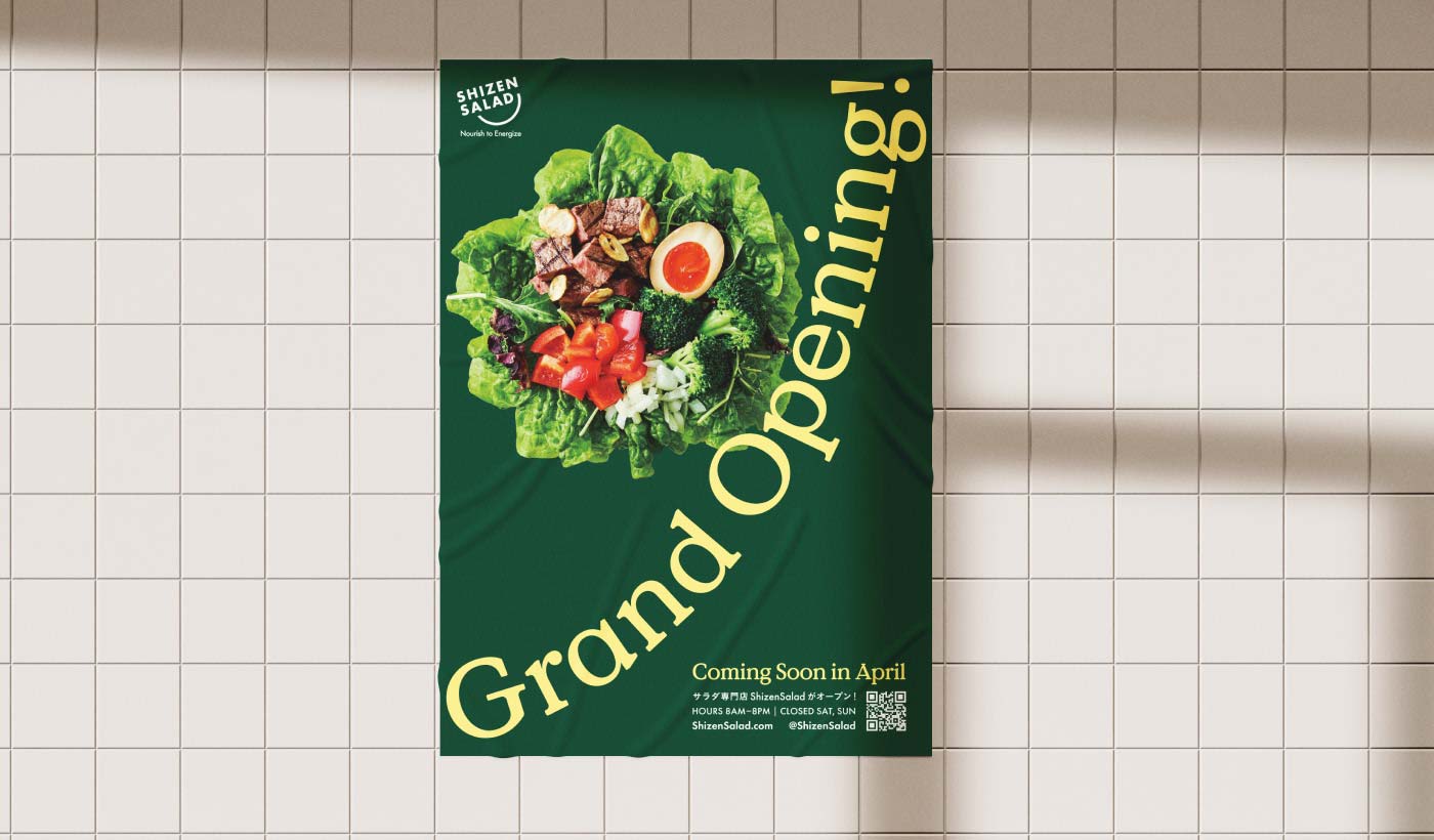
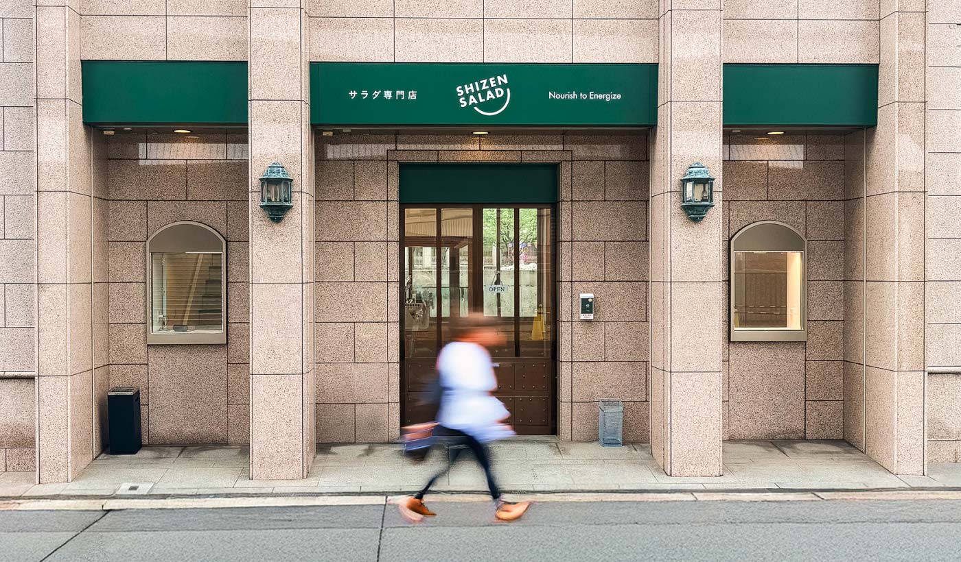
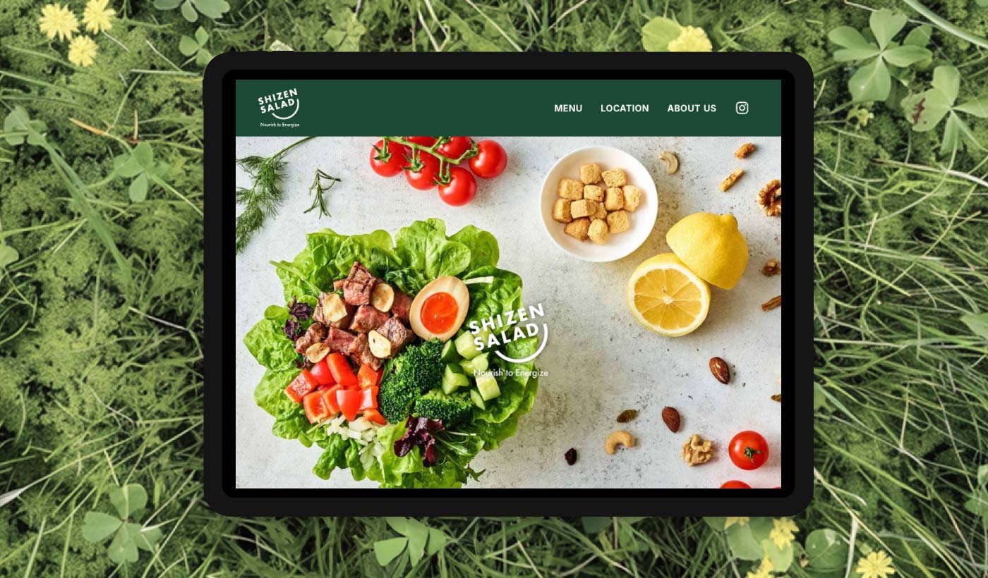
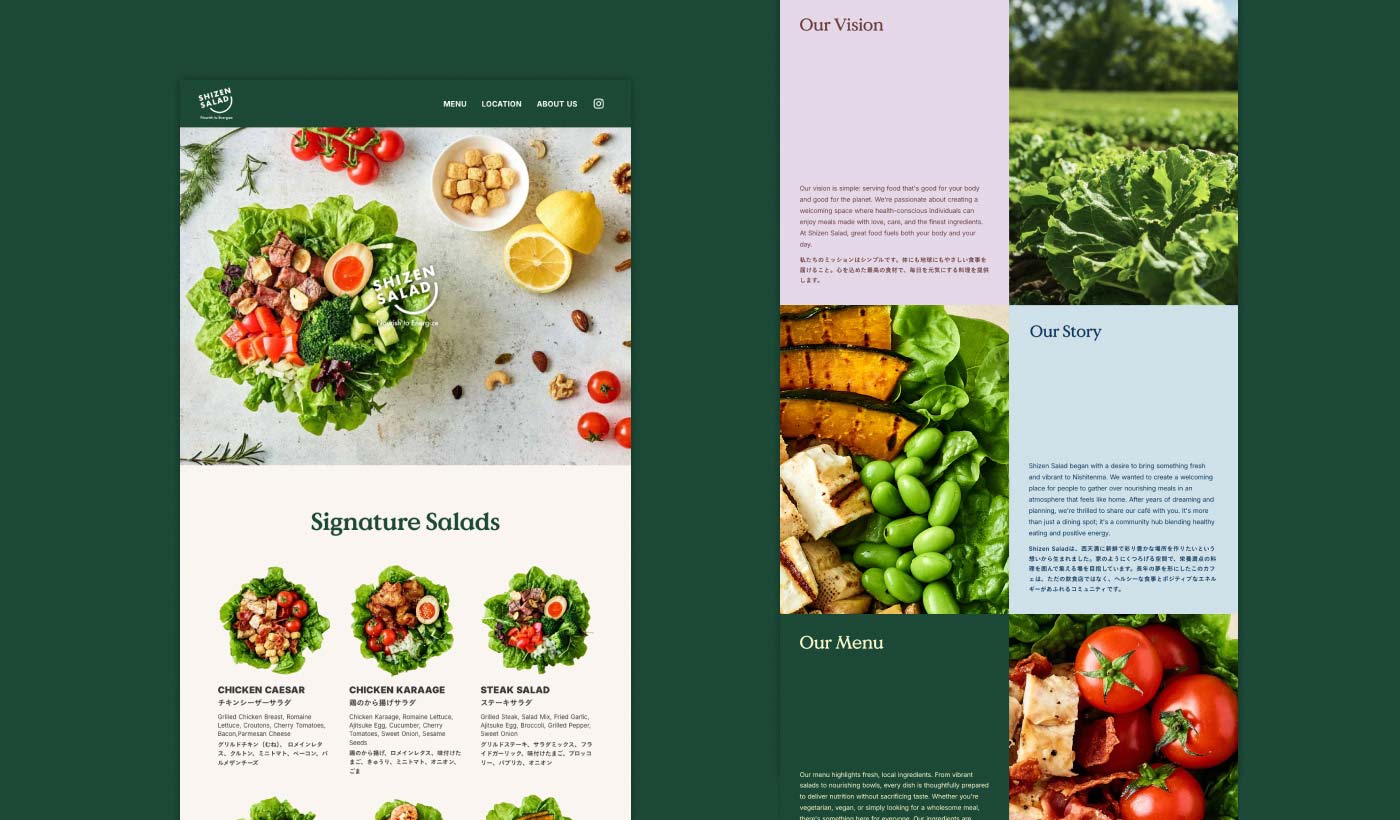
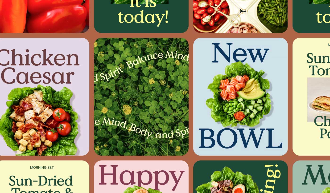
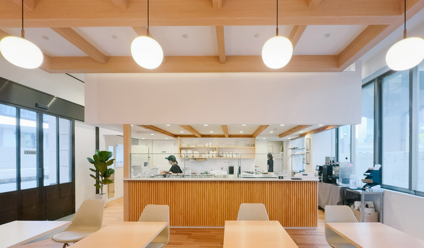
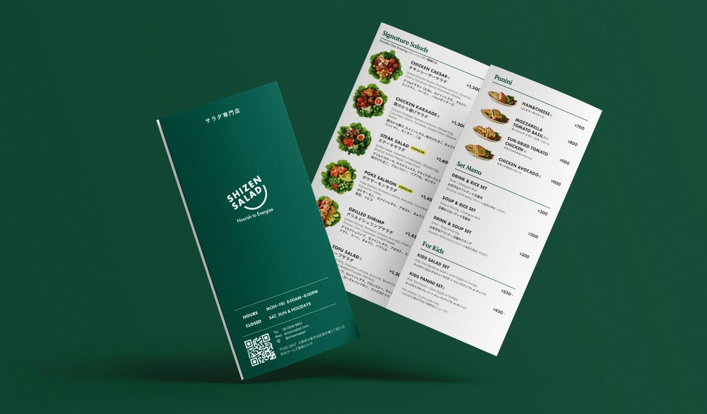
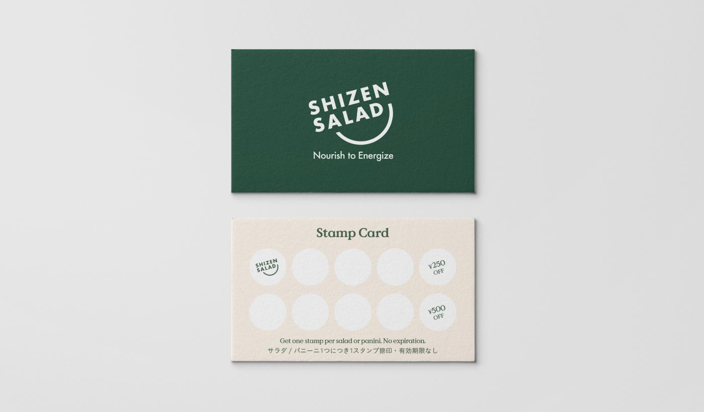
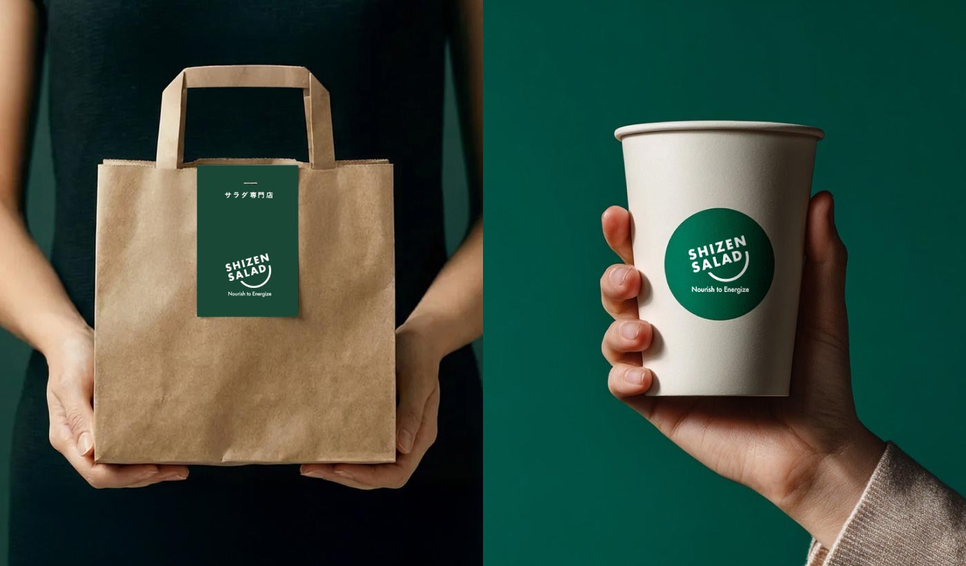
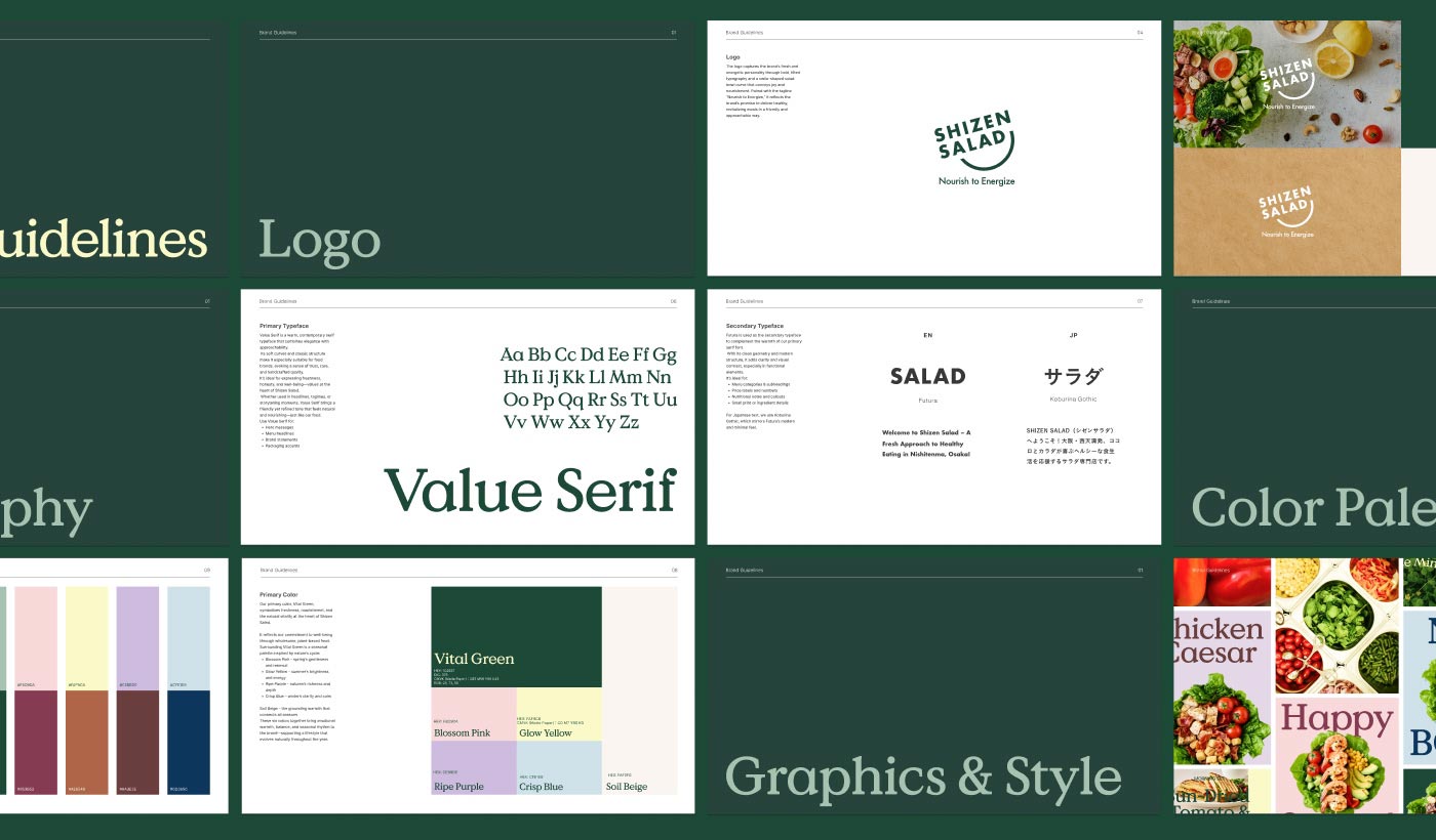
We developed a comprehensive brand system rooted in the philosophy of "Everyday Well-being." Moving beyond a simple logo, we designed a cohesive customer journey connecting every touchpoint—from the core brand identity, digital platforms (UI/UX), print, and packaging, to spatial direction including in-store signage and staff uniforms.
At the heart of this system is an energetic logo designed to act as an uplifting banner for the community. To visually capture the "vibrancy" and true vitality gained from a fresh meal, we utilized dynamic, forward-moving typography. For the symbol, we reimagined the shape of the salad bowl as a warm "smile"—representing the joy that naturally follows a healthy, delicious meal. The result is an inviting and powerful brand presence, perfectly positioned to energize and bring smiles to the local neighborhoods of Osaka every day.
Mayuko Soga — Branding & Web Design
Based in Osaka, Japan
Let's talk at:
hello@mayukosoga.com
© Mayuko Soga Design Inc.